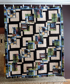
This lovely quilt belongs to Dorothy. It is made from a pattern by Maple Island Quilts called "BQ". It is a great way to use large scale prints. When I brought this quilt upstairs for its photo shoot I was amazed at how great it looked in my living room - great with my purple wall, and on my couch too!
Dorothy requested a panto for this quilt and she left it up to her friend Sherry and I to decide which one. We went with "Fascination". It shows nicely on the back here.
The hardest part of this quilt was deciding on a thread color. I didn't want to take away from the prints or the beige and black framing. Too light a color jumps out on the black and disappears in the beige, too dark a color looks messy on the lights. I wanted a color thread was present on all the fabrics, but that didn't call attention to itself. The winner was this green. Probably one of the "ugliest on the spool" colors I own (So Fine #489), but it fit the bill. When you are unsure give an ugly green a try, the results can be amazing!


Ha, I have that "Ugly" thread too. Amazing how good it is.
ReplyDeleteLinda
Trendy, stylish, chic quilt!!!
ReplyDeleteI have never seen this quilt made with the black and white background and print squares. It looks great!!!
ReplyDeleteWhat a great quilt! I'm with you on thread choice - sometimes that odd color thread is just the ticket for blending with the darks and lights. And I am a big fan of So Fine thread - really sinks into the fabric.
ReplyDeleteWho would have known about that "ugly" green? It's perfect on this - thanks for sharing, as I wouldn't have thought of doing that. You're right about this quilt looking amazing in your home.
ReplyDelete